So I've finally been able to learn some illustrator and am starting to get pretty good at it. I've learned a good amount of special keyboard shortcuts to make things a bit faster as well. A lot of Photoshop shortcuts work, but Illustrator has just as much unique ones I'd guess.
Anyway, before I get started... I'm going to assume that you already know how to create paths with the pen tool. For the assignment I'm doing that lead to this tutorial, We had to get a photo of a bug, trace all of the shapes with Paths and use gradient meshing for shades and whatnot. I haven't started the gradient meshing on mine yet because I like to do things one at a time. I'll get to that when I do the 2nd part of this tutorial.
Make sure you save ALL the time (Ctrl+S) and for you Mac users, Use Cmnd to substitute for Ctrl. Click the photos for a bigger view of the examples.
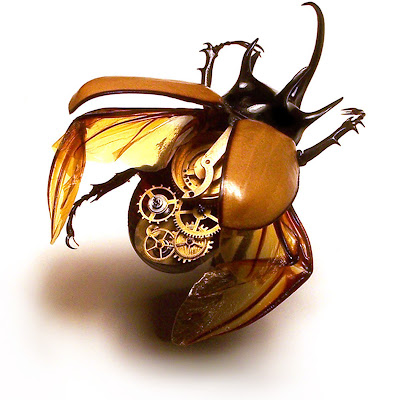
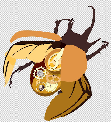
Step 1: Find a photo.
(I chose this one because of how complex it is.)
 Step 2: Preparation
Instead of creating a new file and dragging or importing the photo in, open the photo with Illustrator. The reason to do it that way is so that your swatches are blank. Also, you can adjust your workspace so that the image fits inside it (or vice versa). The
first thing you want to do is make your own swatches. to save tons of time without having to eye drop a billion colors use the blend tool. if you aren't familiar with it, there is a great tutorial I found right
HERE to catch you up. make three small boxes outside of your work space (about 1/2 an inch). Have them be far about 3 inches apart and lined up vertically. Press W on your keyboard (blend tool) and click the 1st box. Next Double-click the blend icon and a menu will appear. Click the arrow on the drop-down and select "specified steps". Put 4 as the amount. Now click the top box (in blend tool mode of course) and then the middle one. Poof! it made 4 boxes in between them with evenly changing values of the same color! Now click the Bottom box to finish it off. It should look something like this:
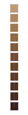
Next you go up to your menus and select Object>Expand. That detaches them. Finally, you go to your swatches and click the tiny folder with the
+ (new color group). That's it! Do this for each color you feel needs variations.
Step 3: Paths and Shapes
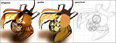
Trace every shape on the image with your pen tool. Although it's probably better to try to match the color of the path to the shape, it's not totally necessary. Sometimes you want to use the wrong color just to see all the shapes separate from each other. When you can, look for shapes that can easily be duplicated and left alone or slightly tweaked. Most IMPORTANTLY, make a new layer for EACH new shape and name them. Naming is good because before you know it you'll end up with 60-100 layers (easily) and lose track of what's where if you don't.
Step 3 1/2: Complex Shapes
Sometimes you'll get lucky and be able to use your shapes tools. But depending on your subject matter, there are more complicated non-organic geometric shapes like gears. Luckily they aren't as complicated as they look. I used a method used for making clocks to make my gears combined with compound layers (paths with holes in them) and the rotate tool.
HERE is a simple tutorial explaining it. If you notice I started on the 3rd page of the tutorial. That's the only part you'll need for this step. After you make your gear "teeth" using that method, you can select all of the teeth and the gear (probably a circle with a hole in it) and click "add to shape" in pathfinder. That will make the "Expand" button in the same mini-window clickable. Click it and everything will become one. Pretty easy huh? Below is The entire steps 1-3 1/2 with a preview of everything. Just getting this far should take a few hours since you really want to get in there and be accurate and neat with your path lines and shapes.
 Step 4: The hard part.
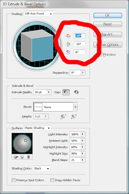
Since I chose a pretty ambitious picture, I knew I'd have more complications. Mainly the gears. Since most of them have many teeth and are three-dimensional, I had to find a way to mimic that. On top of that, they are at an angle. Initially I just wanted to trace them all bit by bit and tweak all of the points for hours upon hours and I quickly knew that there was no way I'd deal with that shit. Instead, I opted to experiment with the 3-d effect. Sometimes it can bea pain in the ass, but I looked up some stuff that really helped. I'll touch on those as I go along.
So since I wasn't going to do it the hard way, I made each gear as if I was facing them directly in the front so that the circles were perfect circles (a good example is on the above picture... notice that the gears arent skewed nor have depth). Notice that they aren't exactly lined up with the original picture. Try to guestimate the right scale if you can. Make a copy of every layer you are going to use the 3D effect on and add "3D" at the end of the name of the copy (this is so that if you mess up, you still have a copy of the shape you are editing). Next, you want to pick any gear and go to ">Effect>3D". Adjust the angles and rotations to be like the picture's gear. You can't really see the original since it's covered but you'll get it. I went from the top-most down. The colors sometimes change with the way the effect shades things.. you can still change the colors when you are done. I found a better way to get the exact side and top colors I want but it involves making permanent decisions that you can't go back on... that will be the next paragraph. To make things faster and easier, write down the Angle numbers (illustrated below) and use them for every gear. Tweak everything for better accuracy.
As I was saying before, You can edit the colors of the top and sides of your new 3D shapes by selecting your shape with the black arrow (V key) and going to >Object>expand appearance>. That makes the effect become permanent. After that, Hold Ctrl+Shift and hit G like 3 times (for some reason it takes 3 times to work on my computer). That makes it so that everything is separate. For instance, now you can click the top of the gear and it only selects the face and not the sides with it. Change the color as you see fit. Moving along...
 Step 5: Color Matching
Go back and tweak all of the colors on everything to be as close to the original photo. It shouldn't take that long (compared to some of these other steps). This will help us get ready for...
GRADIENT MESH!!!!
TO BE CONTINUED
 First assignment for Graphic Symbolism class.


 Front of box and left side. This project was more about cropping and placement and all that. Essence o' Graphic Design if you ask me..
 Back of box. My professor made minor suggestions that made it a little nicer as well. These are getting cut out and put on a grey presentation board. There's really nothing much to say about this one.. it's mostly jsut cutting out each character individually and making backgrounds and typography. It was fun though!
 First I started with the CD Cover. I used some brushes, textures (Plaid and paper) and shapes to get a sort of retro feeling. This was after making a few swatches of colors from an artist I saw in Hi-Fructose that used this same color range. I was satisfied and started thinking about how to use this look as a theme for the rest of the project.
 This part was easy. This is pretty much the cover with a few elements changed or removed and then some additions. It shows up on the back of the CD case as well as the booklet. (more on the booklet later)
 This is the poster. Instead of going vertical I decided to do it horizonal. This was mainly because of the design in the background. There is more type in the final version of this but I placed it in InDesign so that when I print it, the letters are as sharp as possible.
 Just like the Poster I inserted the type in InDesign. It's a pretty big file so I'm lucky we didn't have to print these because college students aren't typically known for having that kind of money lol.


